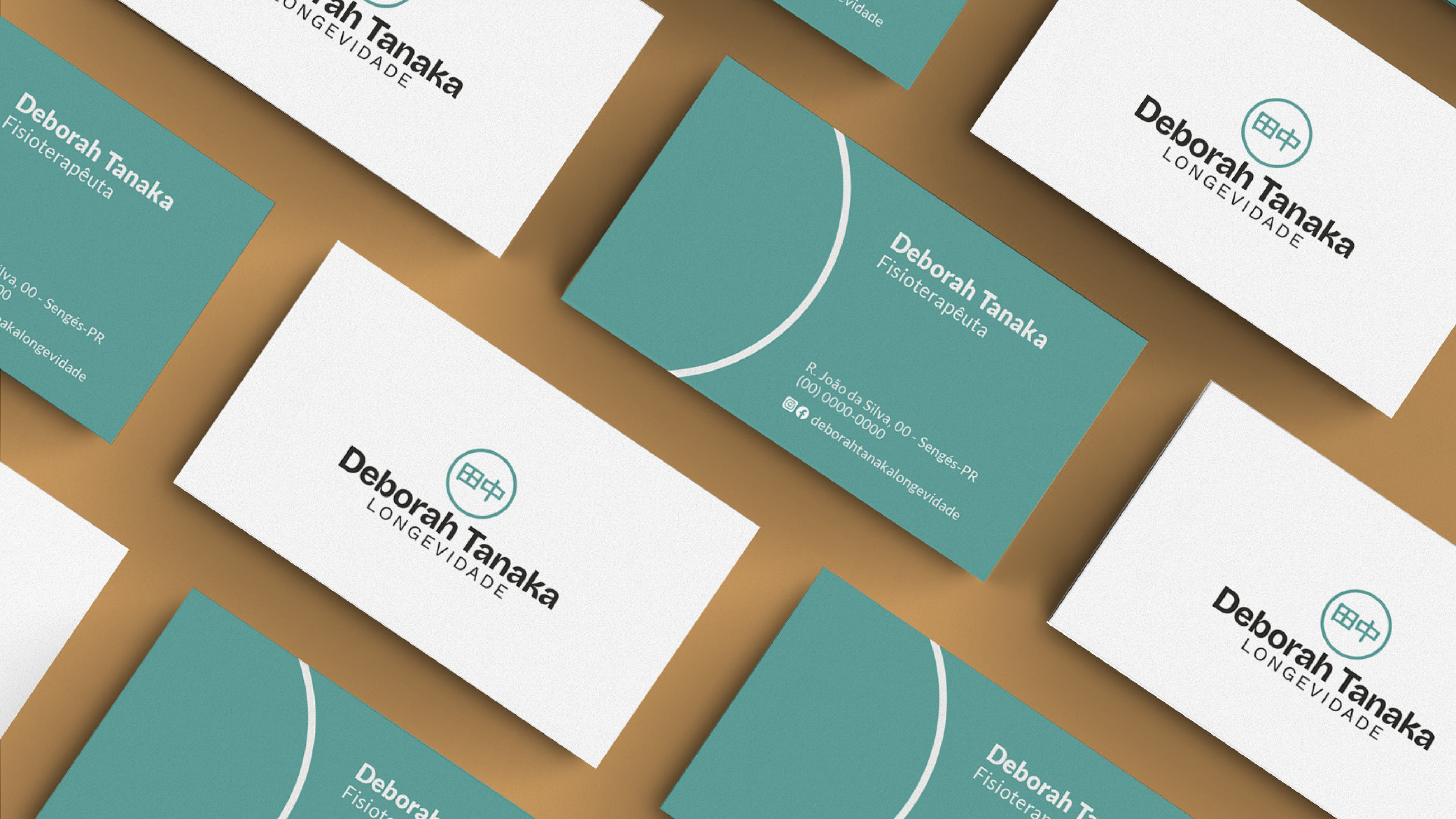
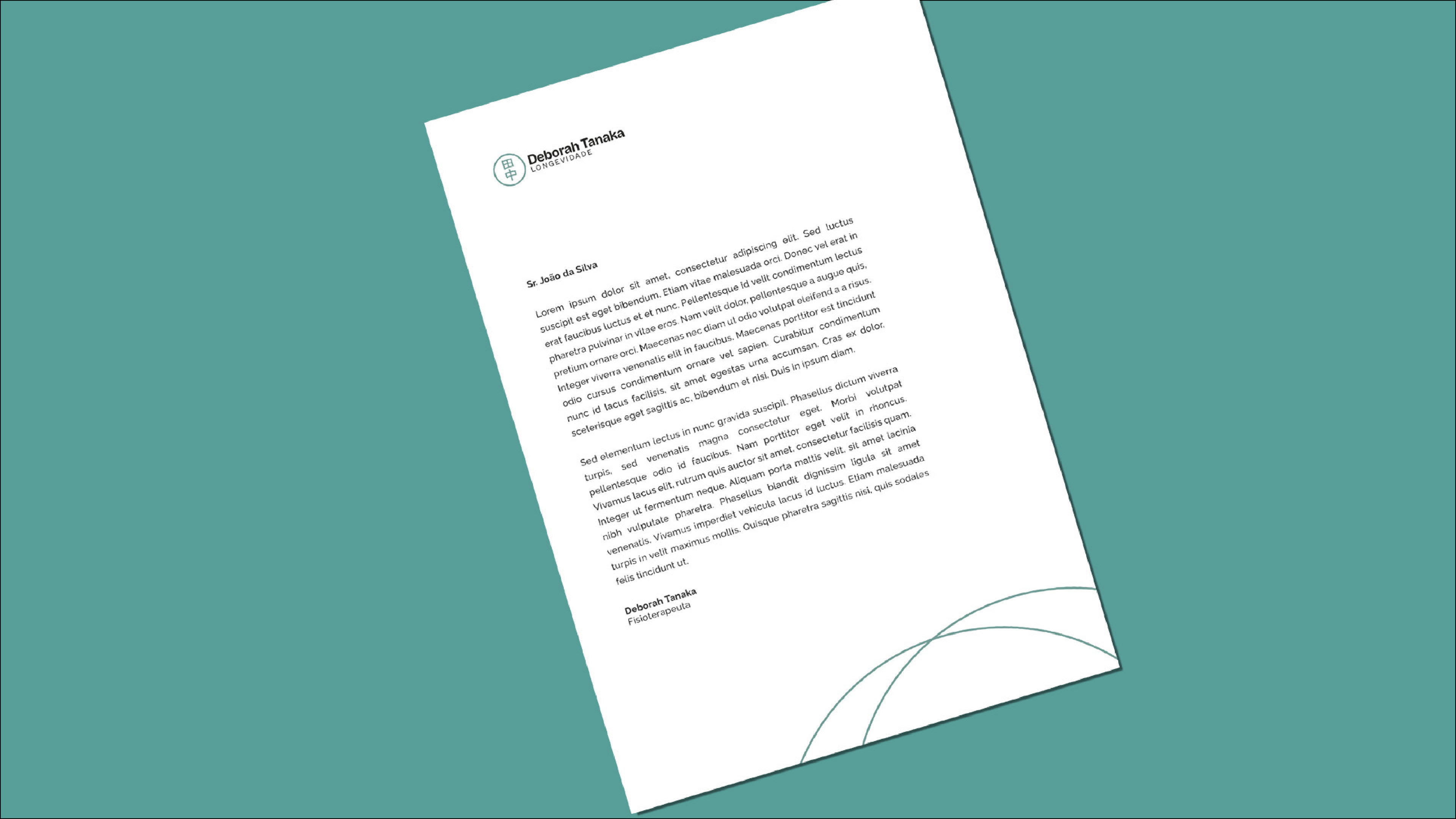
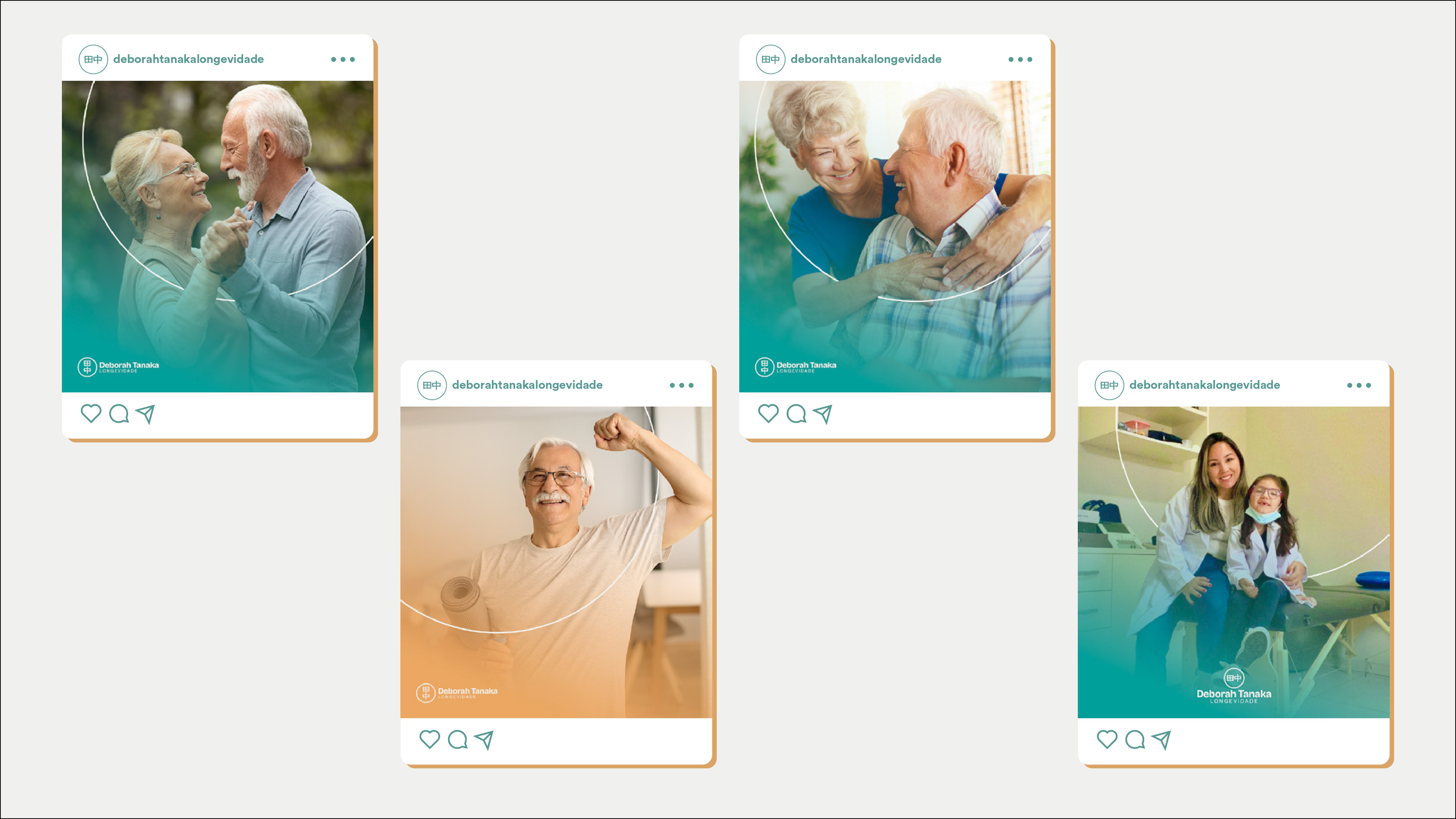
pt - A Deborah Tanaka Longevidade é uma clínica de fisioterapia que visa ser referência na saúde de adultos e idosos, oferecendo atendimento presencial e domiciliar.
Sua identidade é alegre, moderna e confiável, refletindo cuidado e acessibilidade.
eng - Deborah Tanaka Longevidade is a physiotherapy clinic that aims to be a reference in the health of adults and the elderly, offering in-person and home care.
Its identity is cheerful, modern, and reliable, reflecting care and accessibility.

pt - O público-alvo é a classe média C de ambos os gêneros. As cores escolhidas são leves, com destaque para o verde e tons terrosos, transmitindo maturidade. O logotipo combina traços espessos e finos para representar solidez e delicadeza, enquanto o símbolo, através do ideograma, remete às raízes japonesas, associando tradição, história, cultura e longevidade - e também o legado da família Tanaka.
eng - The target audience is the middle class C of both genders. The chosen colors are light, with a highlight on green and earth tones, conveying maturity. The logo combines thick and thin lines to represent solidity and delicacy, while the symbol, through the ideogram, refers to Japanese roots, associating tradition, history, culture, and longevity - as well as the legacy of the Tanaka family.